Glamour Beast
Artistic Inspirations!
Site as of 9/18/24
.png)
.png)
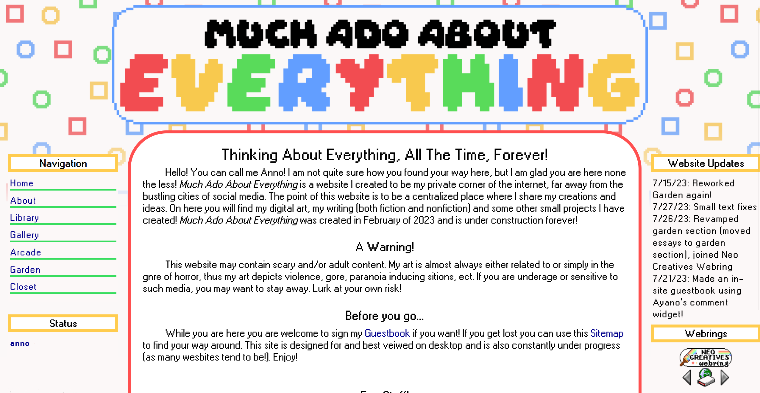
I went for something different here! I used a layout by Teppy's layout's becuase I wasnt happy with the previous version. It was a big visual departure for my site. It was nice and I think it looked good, but I wasnt happy with the structure of it. I think i always really enjoyed the left-side navigation side bar. Many small aesthic choices made thier way from this layout into the current layout!
Site as of 5/3/24

A short lived minimalist version of my site. It did not take me very long to redesign following to this because something felt off about this!
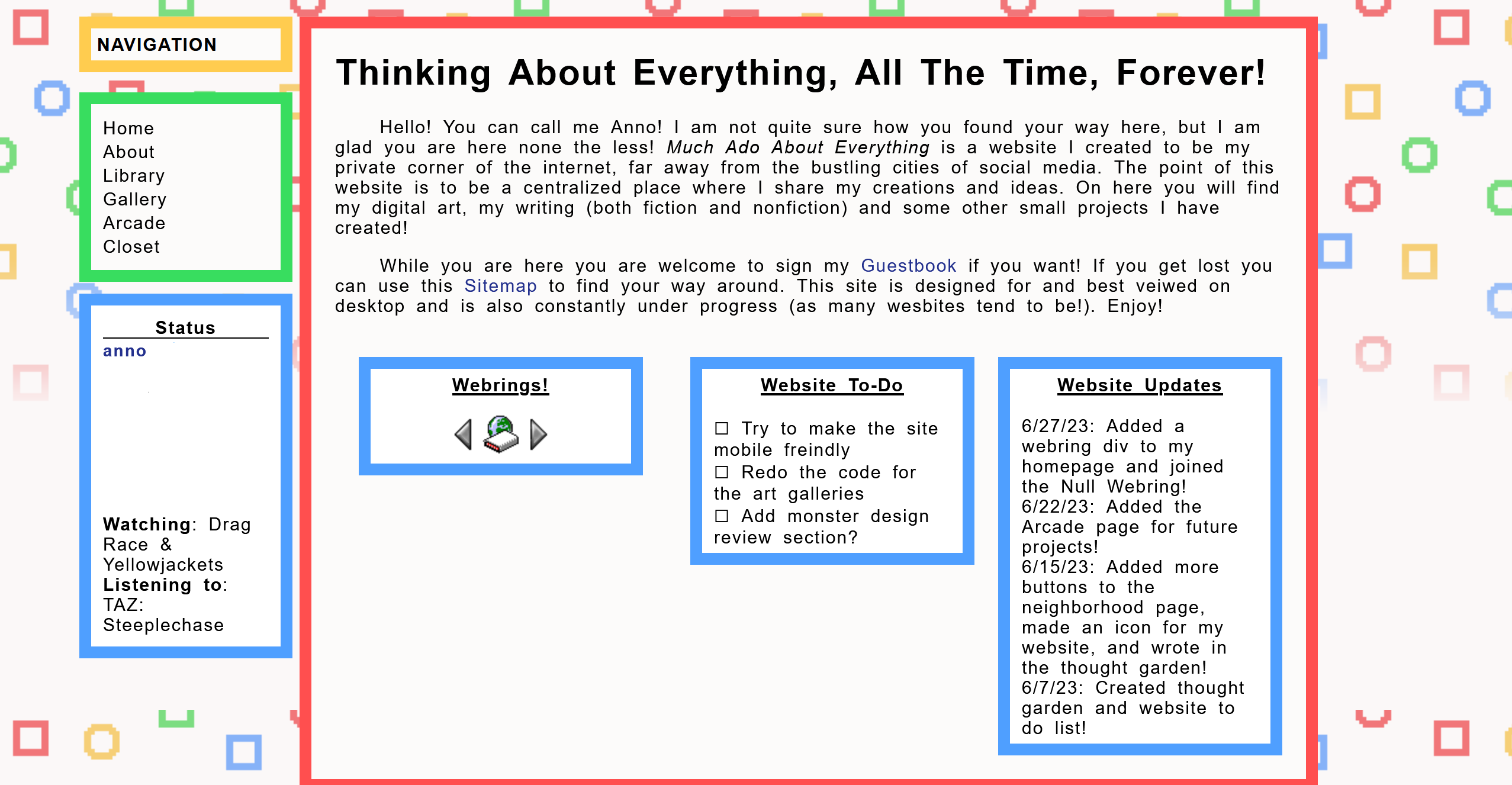
Site as of 8/2/23

Really just an upgrade of the previous style, more spread out! This would remain my site's look generally until March of 2024, so this has been the look of my site the longest as of writing this (3/23/24)!
Site as of 6/30/23

The first time the site took a shape I was really happy with! As of right now the site has maintained this color scheme and general style, which is nice :).
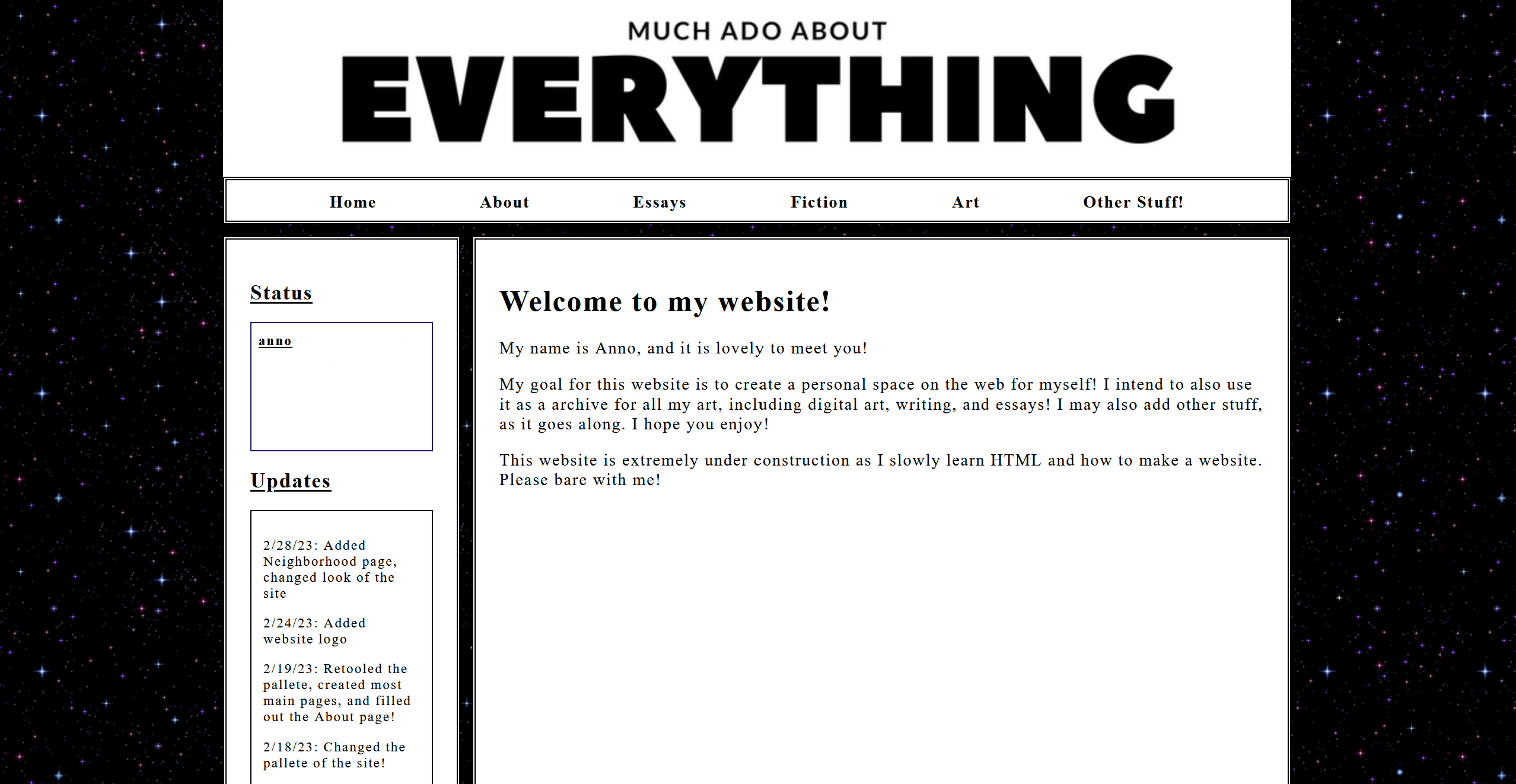
Site as of 3/1/23

The first version of my site that I backed up! This was taken only a month after the sites inception. I cannot remember wether the site looked significantly different within the first month or if this was the general vibe the whole time. I do still like the minimalism and the inclusion of stars, though all that white with no color does make the site look a tad bland to me.